You can upload images in various web formats (depending on your system’s configuration, e.g. WEBP, GIF, JPG and PNG) to your Media Guide.
Depending on your system’s configuration, uploaded images will be automatically converted to WebP.
Upload/replace image
Click on the ‘Upload file’ button below the image editing field and select the desired file. Alternatively, you can import an image from the Media Centre or drag and drop a file directly into the field outlined in dotted lines.
If an image file exceeds the maximum size (in MB) set by the administrator or is in an unsupported format, you will receive a notification.
The content of the ‘Image description’ field is displayed if the image cannot be loaded – or read aloud if people with visual impairments are using the system with TalkBack or VoiceOver.

Edit image
Before you can edit an image, you must first save it!
To edit the image, click on the small pencil icon in the bottom right-hand corner of the image you have just uploaded. A window will open, offering you various editing options. The image size in pixels is displayed below the image.
Rotate image:
Rotate the image 90° to the left or right, or 180°.
Flip the image:
Flip the image horizontally or vertically.
Select a crop:
Select a crop area. Depending on the settings, you’ll be offered a choice of aspect ratios; alternatively, you can select a crop with any aspect ratio.
Scale:
This function allows you to reduce the size of your image as required. The aspect ratio of the image remains the same. The drop-down menu also offers a selection of fixed image sizes
Confirm each change you make to the image by clicking ‘Apply’, or cancel the action by clicking ‘Discard’ if you do not wish to apply the changes.


Define click areas
In the ‘Click Areas’ section, you will see a list of the click areas that have already been set. Next to this is the ‘Edit’ button, which opens a dialogue box.
(In older additor systems, click areas were created in the ‘Edit Image’ section (see above).)
‘Edit Click Areas’ dialogue
You can zoom in on the image using the mouse wheel or a pinch gesture, and move the zoomed-in image.
The shapes of the click areas are not displayed in the front end – they serve only to define the clickable area. If necessary, you must assign icons (see below) or mark the images themselves accordingly.
After creating or editing click areas (see below), click ‘Apply changes’ at the top or the ‘X’ to close the dialogue without applying the changes. In both cases, the dialogue pop-up will close.
Don’t forget to save the image entry afterwards.
Create a click area
Select the shape (polygon, circle, rectangle) next to ‘Create click area’ at the top.
You can still modify the areas after creating them.
- Rectangle: Click on the point in the image where you want the top-left corner of the area to be; then drag the rectangle into shape and click at the bottom-right corner.
- Circle: Click on the image at the point where you want the centre of the circle to be; then drag to draw the circle and click again when it is the desired size.
- Polygon: Click on the image at the point where you want the first corner of the polygon to be; then move the mouse and click again to set the next corner. Close the polygon by clicking on the first corner.
Once you have created a click area, the user interface becomes active and you can define the link by selecting a page.
If you leave the hotspot description (the ‘alt’ tag) blank, the page title of the selected page will be used in the front end for internal pages.
The shape of a click area is not displayed – it serves only to define the clickable area. However, if you select an icon in the bottom-left corner, this will be displayed in the centre of the click area (see below).
Change or delete a click area
Click on a click area in the image. You can now move the click area and adjust its size. For polygonal areas, you can also move the individual points.
You can edit the link or the alt tag (‘hotspot description’).
By clicking on the now-active ‘Delete’ button at the top (with the bin icon), you can remove the click area.
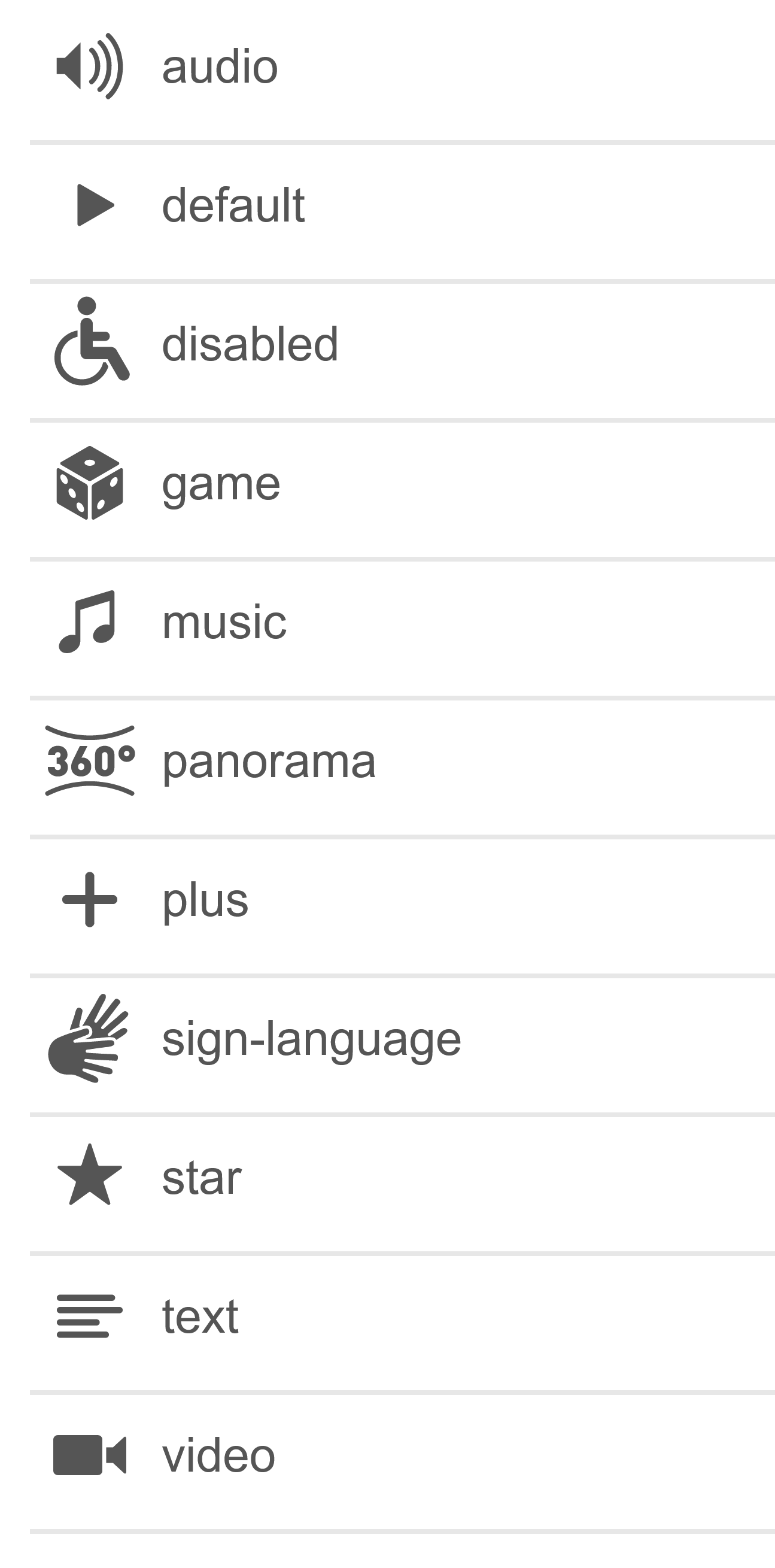
Icons for clickable areas
You can select one icon per click area. It will be displayed in the centre of the click area.
If you select the ‘Number display’ icon type, you can enter a label next to it. This should generally not be longer than 3 characters.
If you select ‘Plus’ (Label), you can add a label to the plus icon.
We’d be happy to customise the icons for you or add further icons.

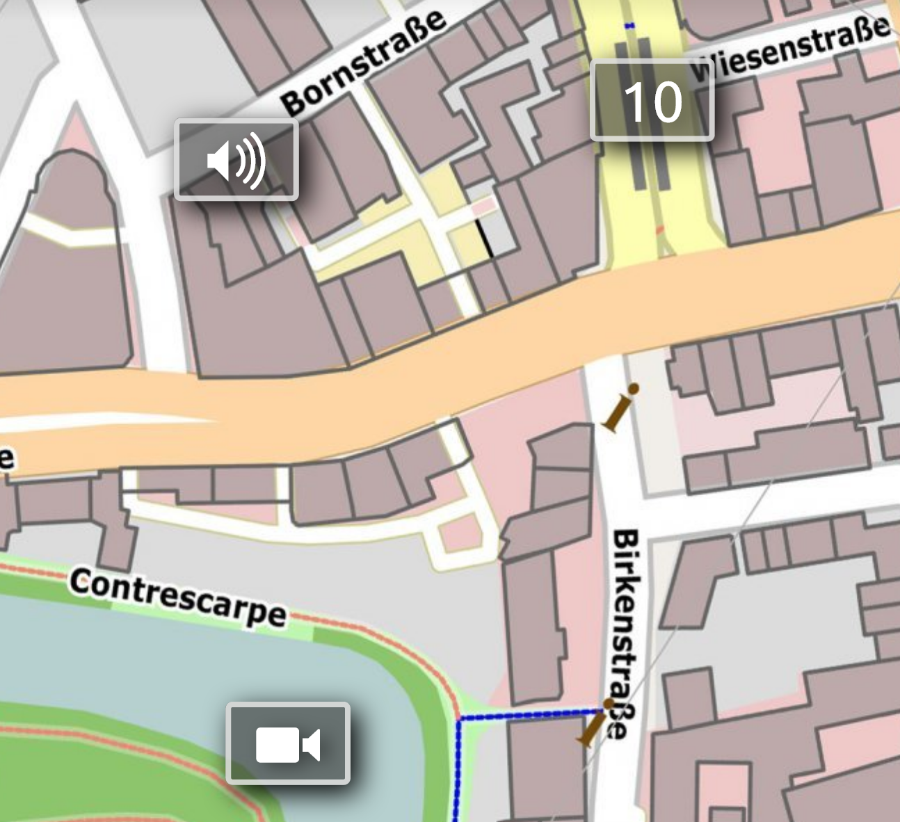
Some of the icons available